Add Menu Update
How clearer UX writing increased menu import adoption by 40%
Overview
Wix Restaurant Menus helps food and beverage businesses create, manage, and publish digital menus on their websites. One of its most valuable capabilities is converting an existing file-based menu into a fully editable Wix menu, but the original upload experience created friction at the very start of that journey. This project focused on redesigning the entry point and upload flow to make the feature easier to understand, easier to use, and more aligned with what restaurant owners were actually trying to accomplish.
Context
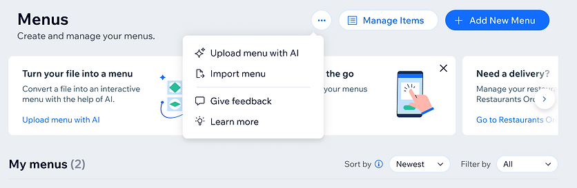
Within Wix Restaurant Menus, users could create a menu in two ways: build it manually from scratch, or import an existing PDF and convert it into an editable Wix menu. The second option had strong potential because it reduced setup effort for businesses that already had menus, but many users dropped off early in the process. The feature was also labeled “Upload menu with AI,” which did not clearly communicate the task users wanted to complete.
Scope
This project covered content and UI changes across two core areas:
-
The main Menu page, where users first decide whether to add a new menu manually or import one from a file.
-
The upload flow, where users select a file and move through the modal that converts a PDF menu into an editable Wix menu.
Problem
The original experience was difficult to understand. The two menu-creation options were located in different places, the “Learn more” content was not especially useful and appeared in an odd location, and the upload modal lacked clear guidance about what users were supposed to do and why they should do it. On top of that, “Upload menu with AI” did not reflect the user’s goal very well, which made the feature feel less intuitive.
Goals
This project had both user and business goals:
-
Business goal: increase adoption of the menu import flow.
-
User goal: help restaurant owners quickly understand what the feature did and why converting a file-based menu into an editable Wix menu would be useful.
Constraints
The work had to be completed under tight practical constraints. There were no developers available to support the task, so the solution had to stay lightweight enough for one person to design, rewrite, and implement independently using Claude-assisted coding.
My role
As UX Writer, I took ownership of the project from end to end. I identified the opportunity, redesigned the UI in Figma, rewrote the content across the experience, adjusted the implementation myself, and rolled out the update.
Decision and rationale
The first step was to simplify the experience so users could understand their options immediately. Rather than emphasize the underlying technology, the content needed to match the job users were actually trying to do: take an existing menu file and turn it into something editable on Wix. That meant rethinking both the interface and the feature naming.
Solution
1. Redesigned the entry point
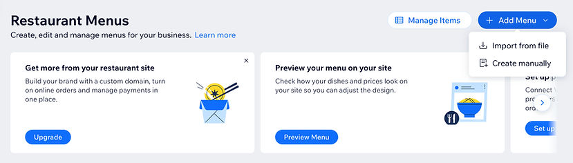
I reworked the main Menu page in Figma to make the experience easier to navigate and easier to understand at a glance. The goal was to reduce confusion between the available menu-creation options and present the import path more clearly within the overall information hierarchy.
2. Renamed the feature
I replaced “Upload menu with AI” with “Import from file” and placed it inside the Add Menu dropdown. This wording matched the language users were more likely to search for or expect when trying to convert an existing PDF menu into an editable one.
3. Removed “AI” from the primary label
I intentionally removed AI from the feature name for three reasons:
-
Users were focused on the end goal, not the underlying technology.
-
Some users still did not fully trust or understand AI, which could create unnecessary hesitation.
-
The AI processing happened behind the scenes, so calling it out at the beginning of the flow was less useful than describing the actual task outcome.
4. Reworked the upload flow content
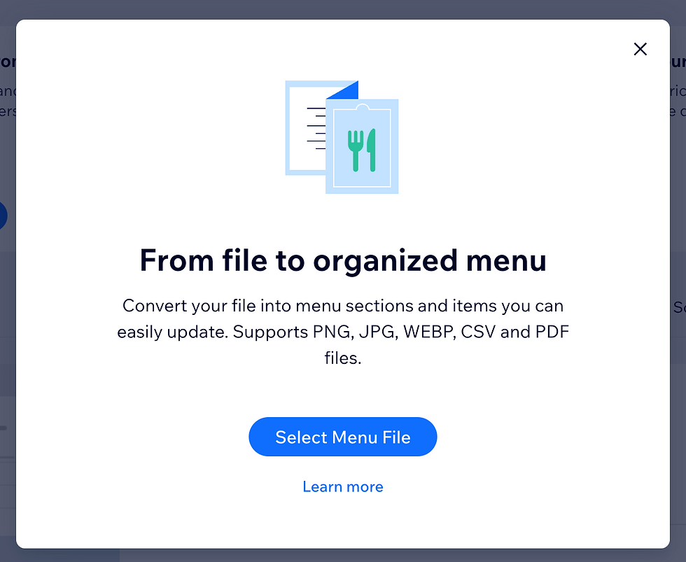
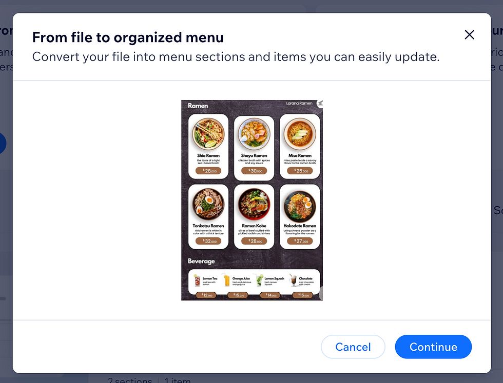
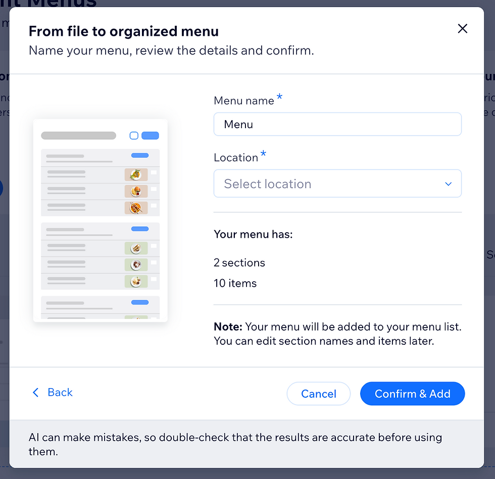
I rewrote the modal flow to make each step more explicit and more helpful. Instead of dropping users into Wix’s media manager with little explanation, the new flow clearly instructed them to select a file, explained the benefit of converting the file into a Wix-native menu, and cleaned up the surrounding content to reduce ambiguity.
Outcome
The redesign was launched as an A/B test and produced strong results. Adoption of the redesigned menu import flow increased by 40 percent, and Premium purchases increased by 4.5 percent. The updated design replaced the old one, and the Menus experience also saw reduced churn and fewer customer care emails.
Reflection
This project was especially important because it was the first time I led the full process across writing, design, and development. I identified the problem, shaped the solution, used Claude to handle the code changes, and shipped an update that created measurable value for both users and the business. It also reinforced a principle that has stayed central in my work: users respond better when content describes their goal clearly rather than technology that is happening behind the scenes.