Online Programs
Improving AI-powered program creation in Wix Online Programs
Overview
Wix Online Programs lets businesses create and sell structured programs directly through their Wix site, combining lessons, scheduled activities, and content into a guided experience for participants. This project focused on improving the AI-assisted program creation flow by replacing an open-ended chatbot experience with a clearer, more visual journey that better guided users from idea to launch. The result was a 23 percent increase in users completing the flow and launching an online program.
Context
Users could create an online program in three ways: start from scratch, edit a template, or use AI. Originally, the AI path relied on a conversation with Wix’s chatbot, Aria, but that experience led to very low completion, with only around 4 percent of users finishing the flow and launching their program. Because this was a high-potential feature, the experience needed to feel more predictable, more guided, and easier to understand.
Scope
This project covered content and UI decisions across two main areas:
-
The main Online Programs page, where users could choose to create a program with AI.
-
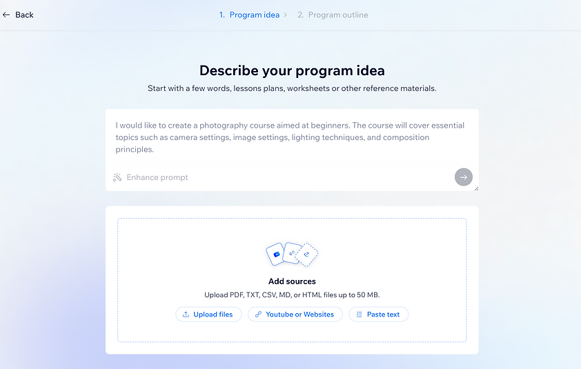
The Create with AI flow, a new, more visual experience that replaced the earlier chatbot-led interaction.
Problem
The original chatbot-based flow was not especially user-friendly. It set very few expectations up front, and because the bot responded differently depending on how each user phrased their request, the experience could feel inconsistent and hard to navigate. Users were being asked to enter basic settings before focusing on the most important part first, the online program itself.

Goals
This project had both business and user goals:
-
Business goal: increase adoption and successful completion of the AI-powered program creation flow.
-
User goal: help users more easily understand, navigate, and complete the process of building an online program with AI.
My role
As UX Writer, I owned the content within the new flow and worked closely with the designer to shape a clearer, more guided experience. My role focused on helping transform the AI path from an open-ended conversation into a structured product journey that users could understand step by step.
Decision and rationale
The central product decision was to move away from a pure chatbot experience and create a more guided interface. Instead of expecting users to know how to prompt the bot well, the flow would help them understand what information was needed, what the AI was doing, and what would happen next. This shift made the interaction feel less like improvising with a chatbot and more like completing a clear, goal-oriented workflow.
Solution
1. Replaced the chatbot-first experience with a guided UI
The first major change was to design a dedicated creation flow instead of relying on open-ended chat alone. This created a more structured, visual experience that aligned the content, layout, and steps so users could understand what they were doing and move through the process with less guesswork.
2. Made it easier to add source material
The new flow introduced a clearer way for users to add any resources they already had, such as files or reference materials connected to the program they wanted to build. This reduced the burden of starting from a blank slate and gave the AI better input to work from.
3. Added transparency during processing
Because AI-generated program creation can take time depending on the amount of uploaded information, the experience needed better feedback. We introduced a progress state that showed users what the system was currently doing, such as analyzing files, identifying key topics, and generating the initial outline. This made waiting feel more understandable and more trustworthy.
4. Created an editable outline before full generation
Before generating the full course, the new flow showed users a basic outline of the program that had been created for them. This gave them a chance to review the structure, understand what they were going to get, and make changes before the full content was built.
5. Clarified the final content-generation step
The last stage focused on generating the actual program content that would fill the sections and lessons in the outline. By this point, users had more visibility into the flow and more confidence in the output, which made the transition into content generation feel more intentional and less opaque.


Outcome
The redesigned flow led to a 23 percent increase in users completing the experience and launching their online program. That result was especially meaningful because the original AI flow had a very low completion rate, and the new experience improved both clarity and follow-through without removing the complexity of the underlying task.
Reflection
This project reinforced an important lesson about AI product design: users do not just need a powerful system, they need a clear path through it. In this case, the problem was not that AI lacked value, but that the experience asked users to navigate too much ambiguity on their own. By replacing a loose chatbot interaction with a more structured, transparent, and editable flow, the product became easier to trust and easier to complete.